Our list of inspiring graphic design trends will help you direct your thoughts to certain popular directions. Choose what best fits your brand.
Do you follow the trends?
We are very fond of the saying “You do you”.
Your design should always reflect your brand. No exceptions. Attract the right kind of customer with a design that clearly speaks about you. This includes both your company and your products.
But, with that said, there is nothing wrong with checking the graphic design trends. This will give you an idea of what’s especially popular these days. After getting to know the trends, you can incorporate what fits into your designs. This way you will have a design that is both great representative of your brand and also trending. It is a win-win situation.
The graphic design trends our designers are most fond of are:
- Maximalism
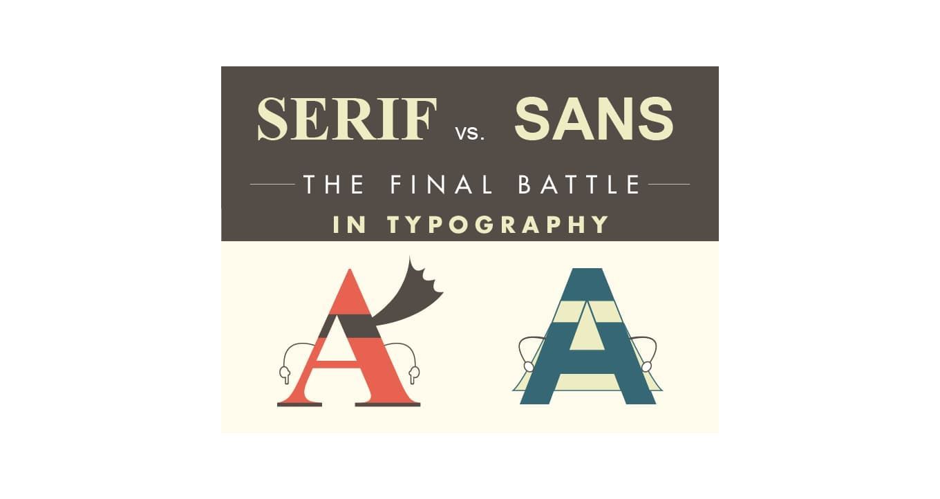
- Experimental typography
- Eco
- Candy colors
- Art deco
- Simplified logos
- Minimalist retro
- Dreamy muted gradients
- Modular geo
- Achromatic design
Examples of graphic design trends
Maximalism
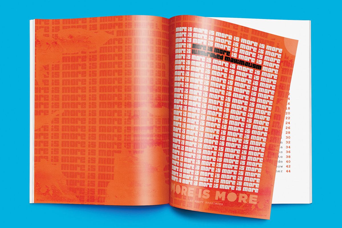
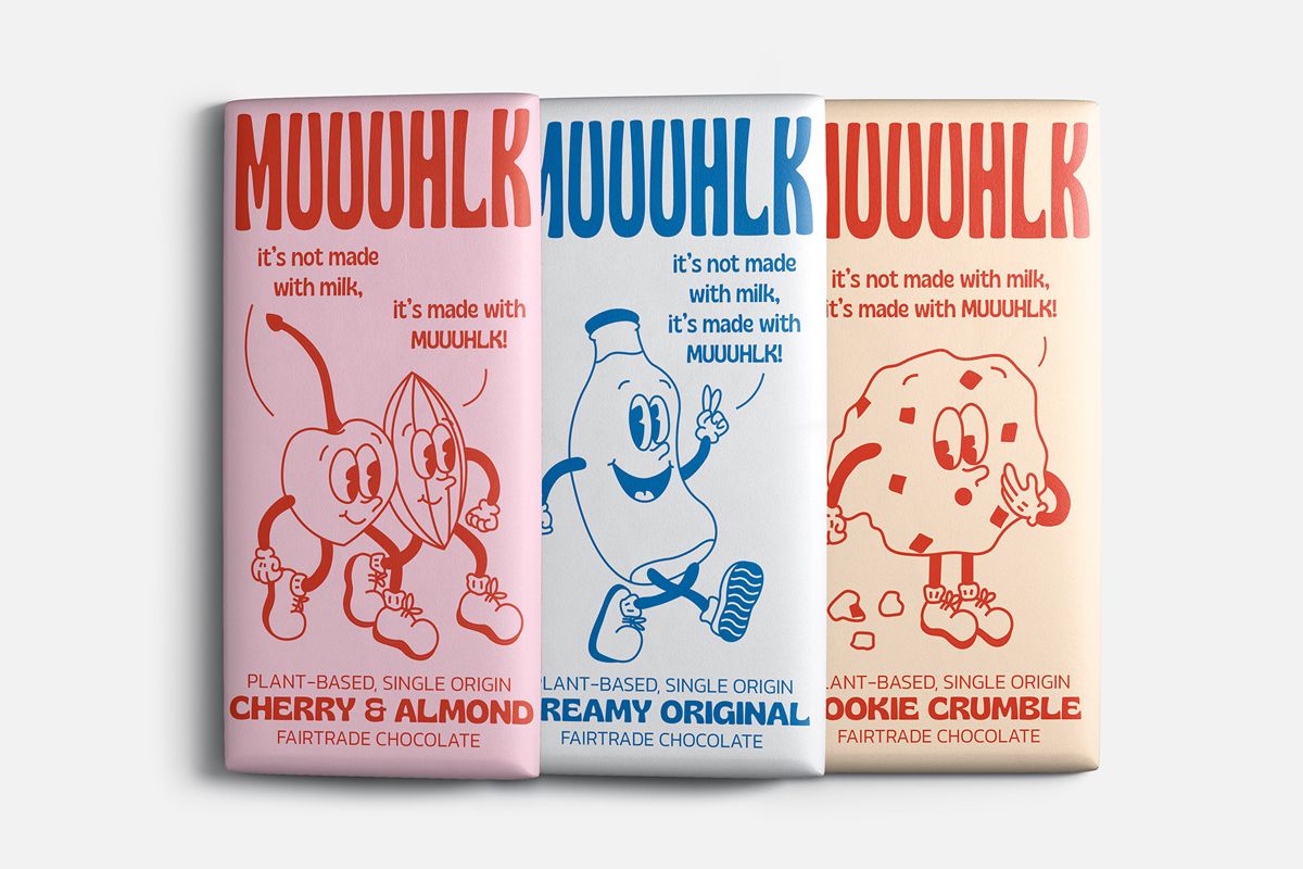
We often hear that less is more. But, sometimes it is just the opposite - more is more. :) The wait is over. You can go overboard with your design, says the prediction for the graphic design trends.
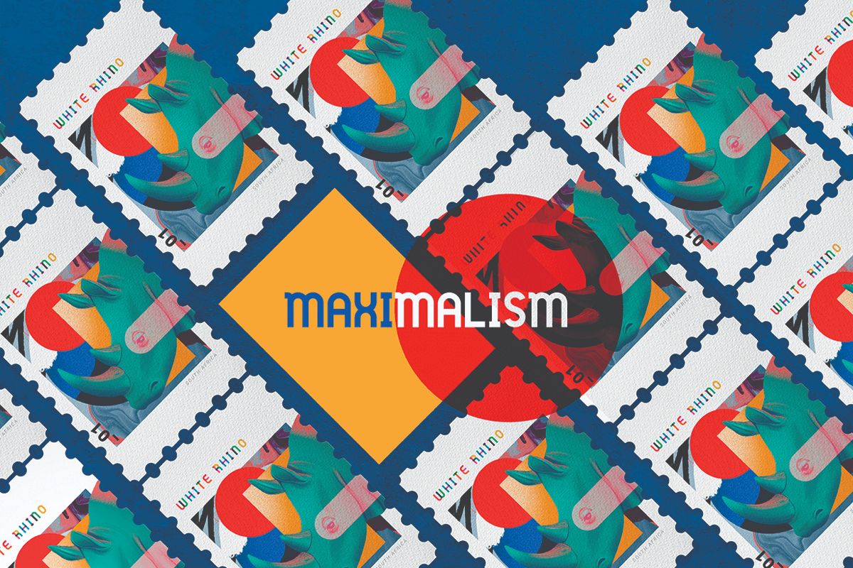
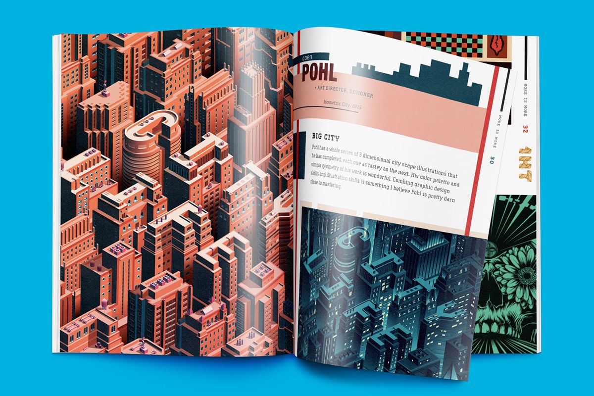
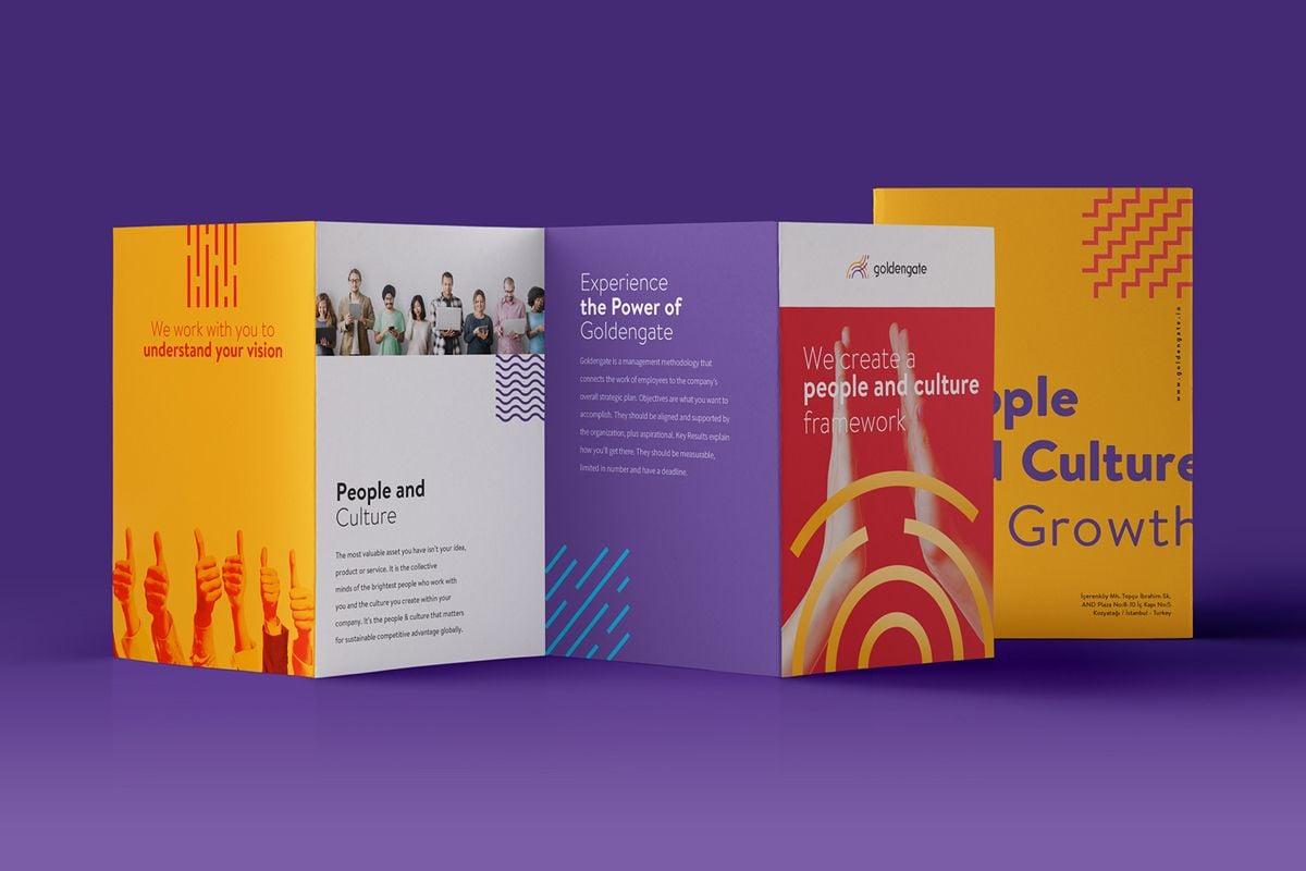
Add colors, objects, and patterns that reflect your busy mind. Focus on single elements. Don’t think about the overall picture, elements don’t even have to fit together. When the design is done this way, your potential customers will be able to find something new and exciting every time they look. Don’t be modest, make it bold and adventurous.
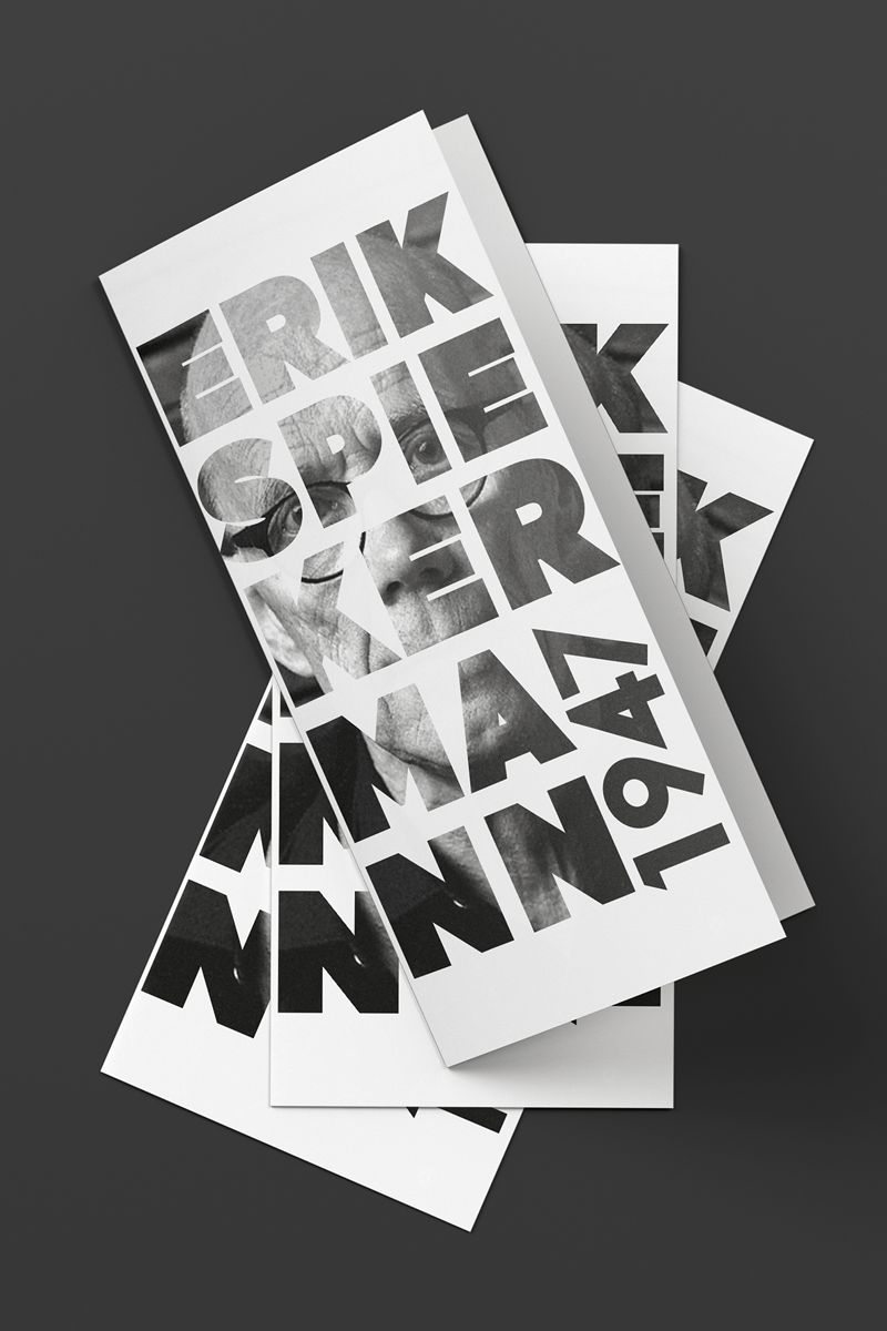
Experimental typography
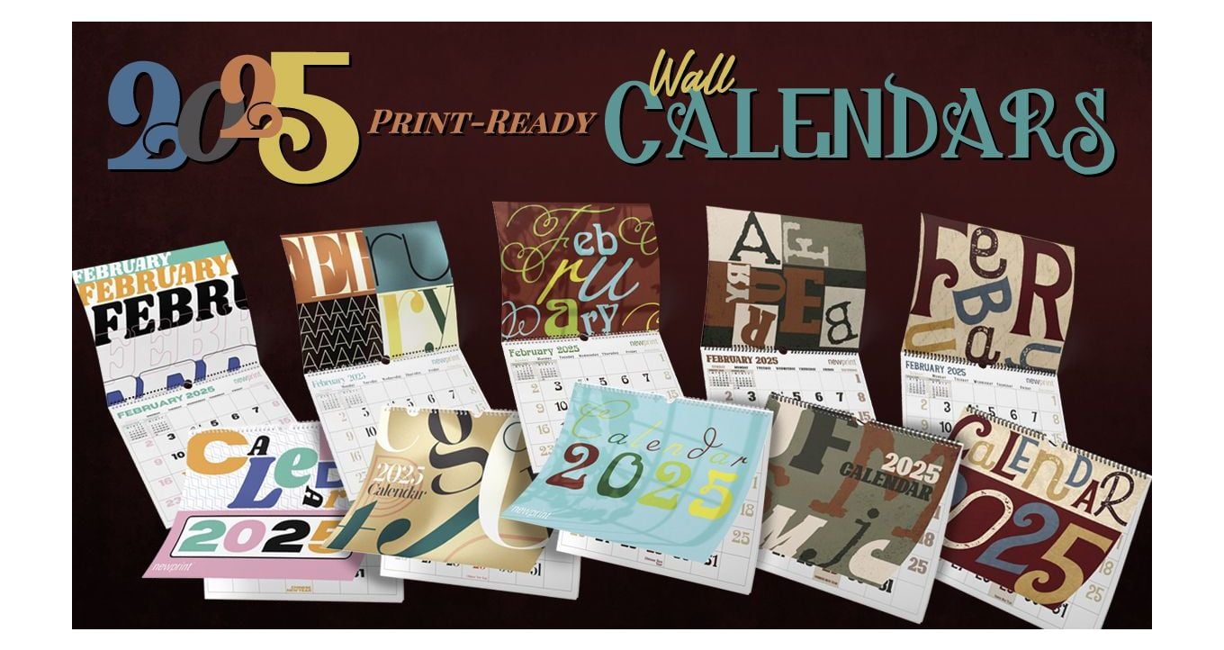
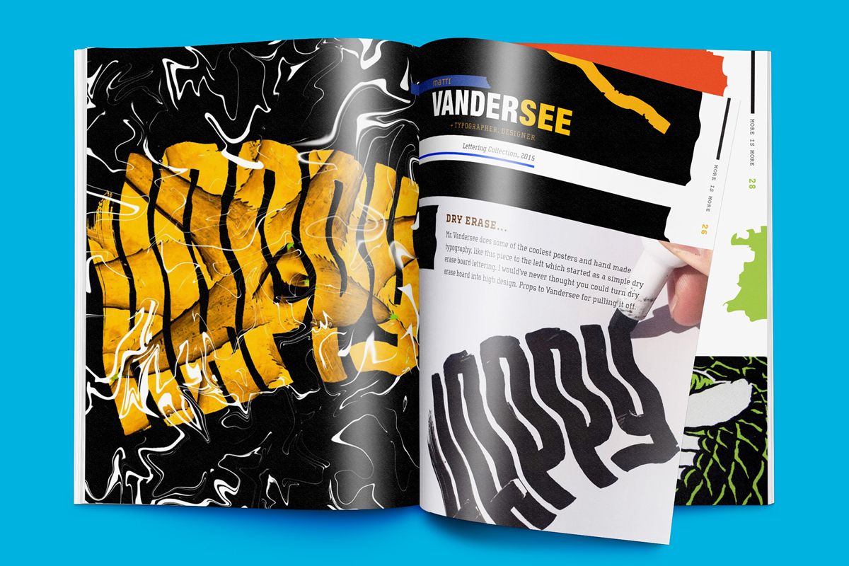
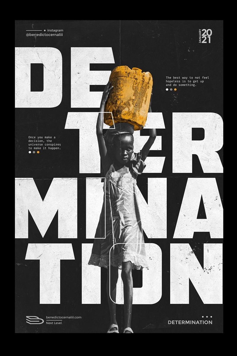
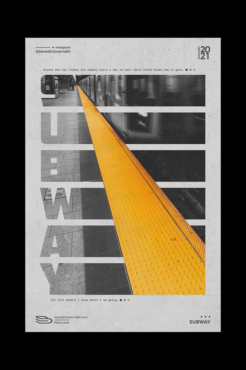
Make your letters a work of art. Although, we don’t recommend using them for longer text. But it is perfect eye candy for catchy headlines. Using vivid colors and contrasting shapes can help emphasize the emotions you want to promote. And it is always good to affect your customers on an emotional level.
Eco
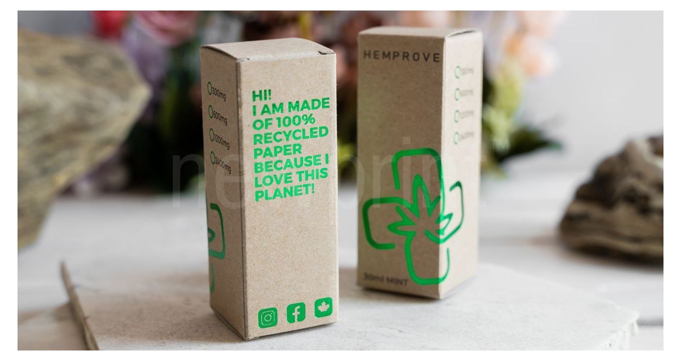
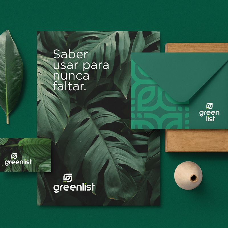
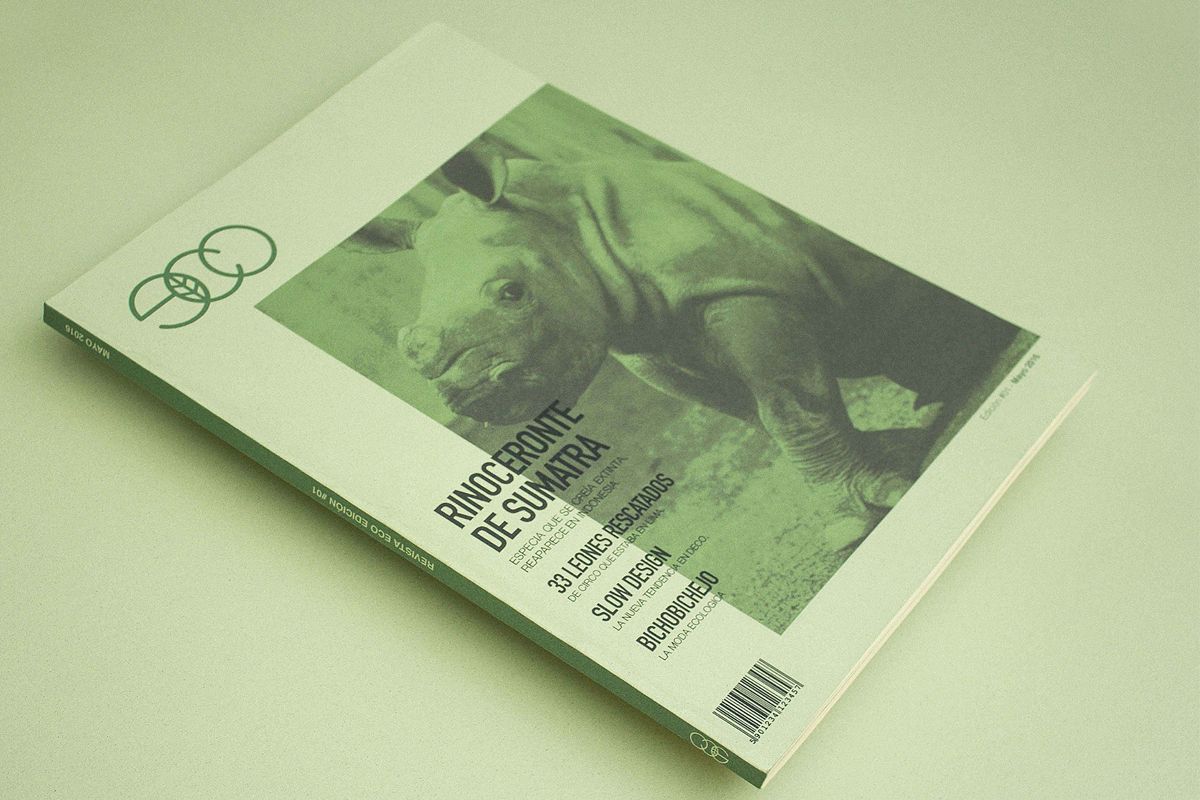
The popularity of eco-friendly products is growing each day. Having sustainable packaging makes your brand even more attractive for aware customers. Every day there are more options that are both sustainable and visually appealing. And your design should reflect your effort. In this case, there’s nothing wrong with bragging. Let everybody know that you are trying to make this world a better place. Like-minded people are sure to appreciate it. And who knows, you may even inspire someone new.
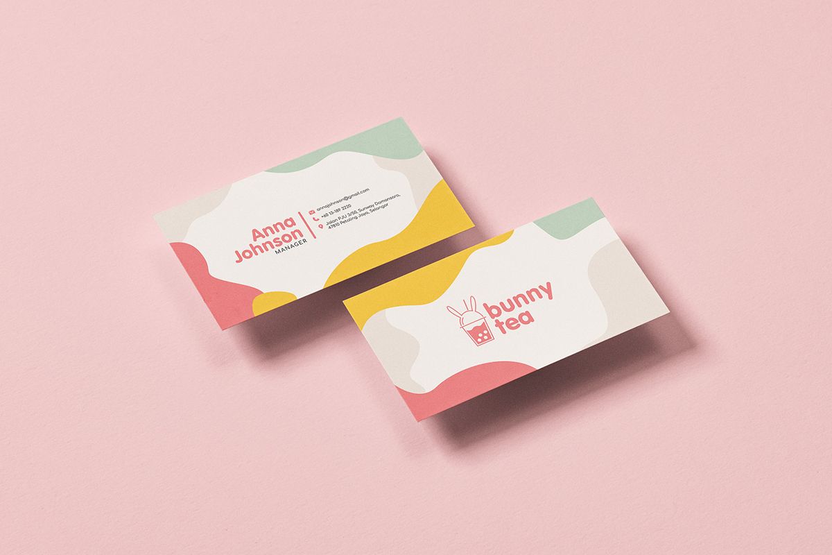
Candy colors
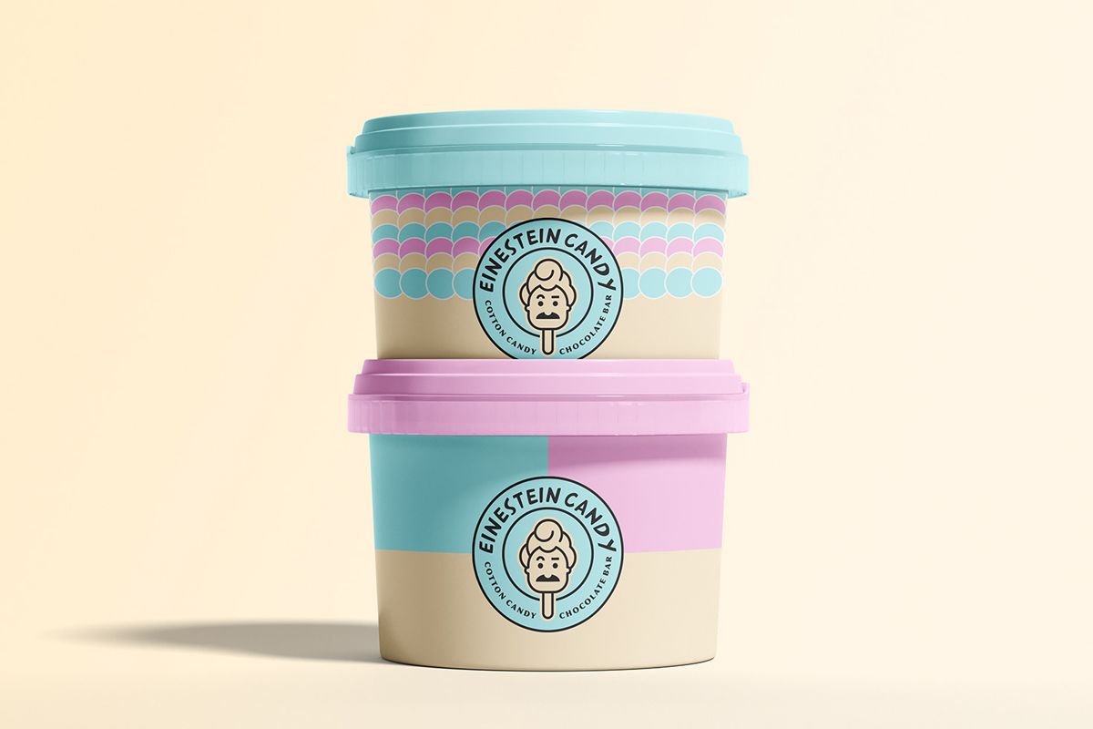
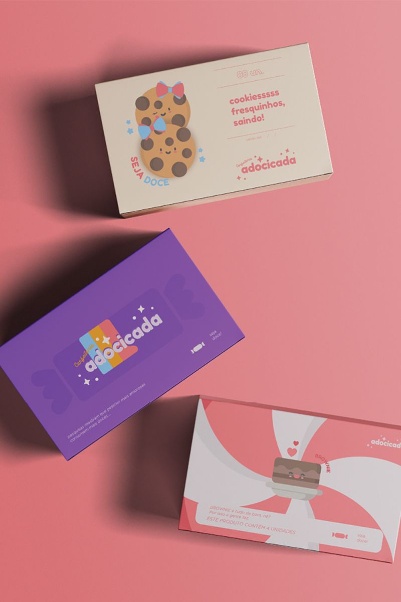
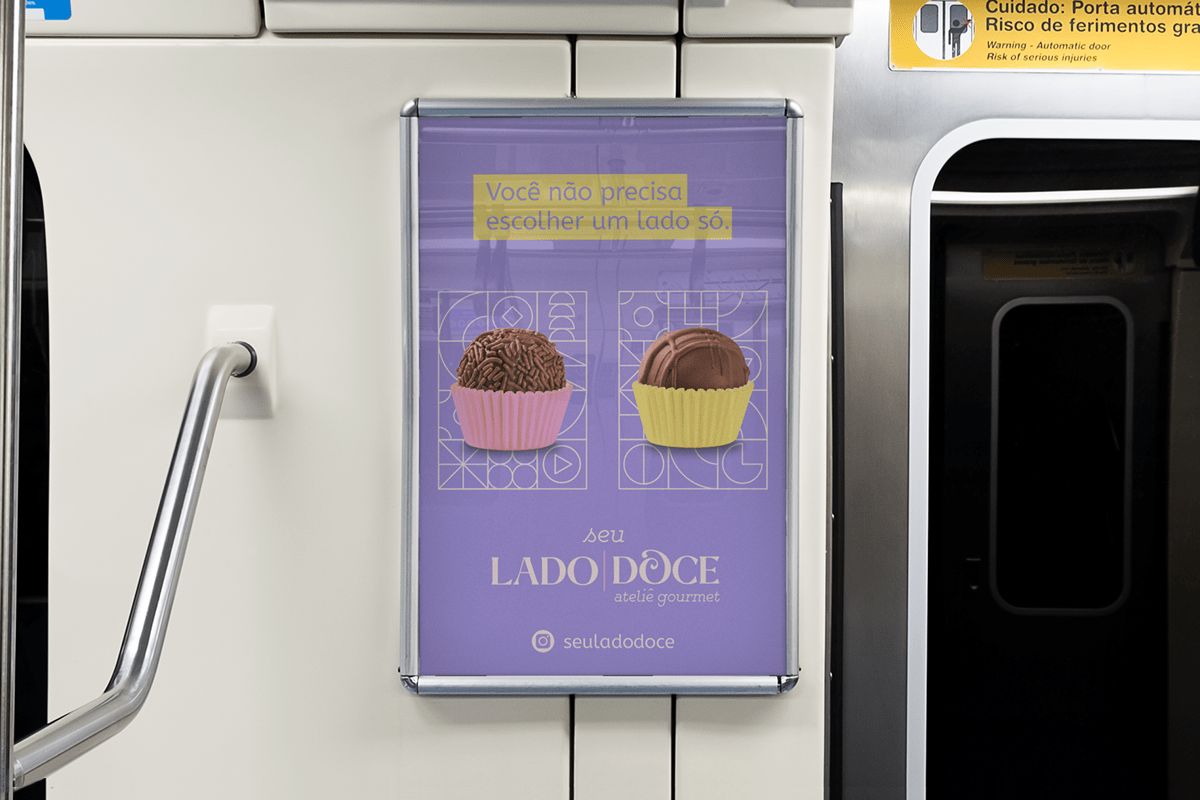
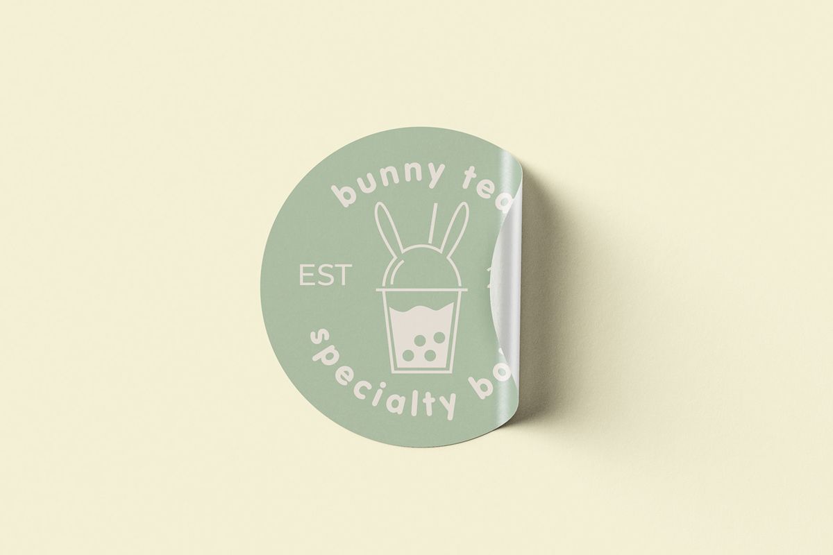
Pastel colors will never be out of fashion. But, if you want your design to stand out, use vibrant candy colors. They are very visually appealing and demand attention. You could even say they are eye candy for your customers. And eye candy is as important as the quality of your product or content. Some people may fight me on this. But, you need to make people look at what you have to offer before they can recognize the quality. These colors can seem a bit psychedelic sometimes. But they are always friendly and mesmerizing.
Art deco
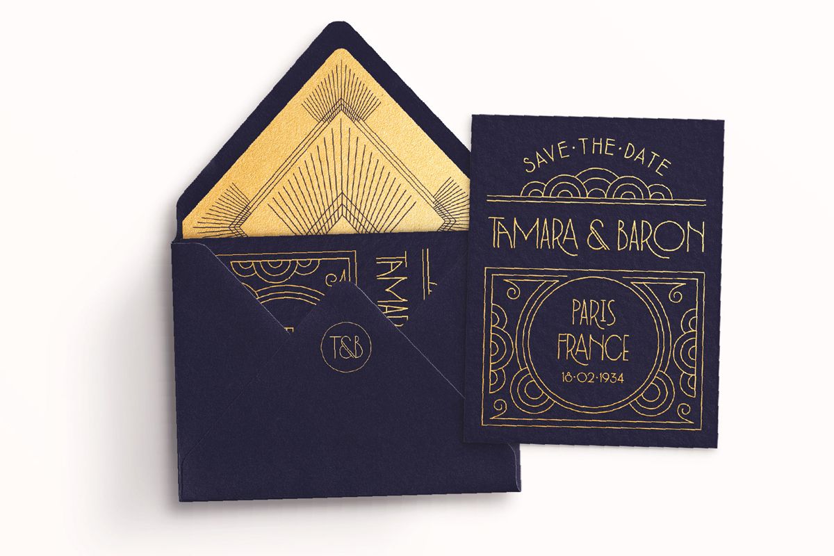
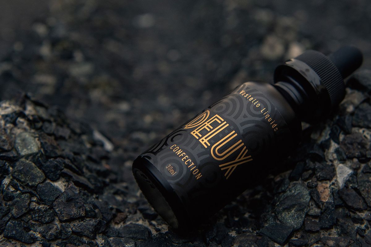
For those who do not enjoy crowded designs with a lot of details, there is Art deco. This style promotes clean design and sleek geometry. It is all about sturdiness, resilience, dignity, and modernism. The world is waiting to part ways with what has been happening for the past couple of years. That is why we can all relate to these values to at least some degree.
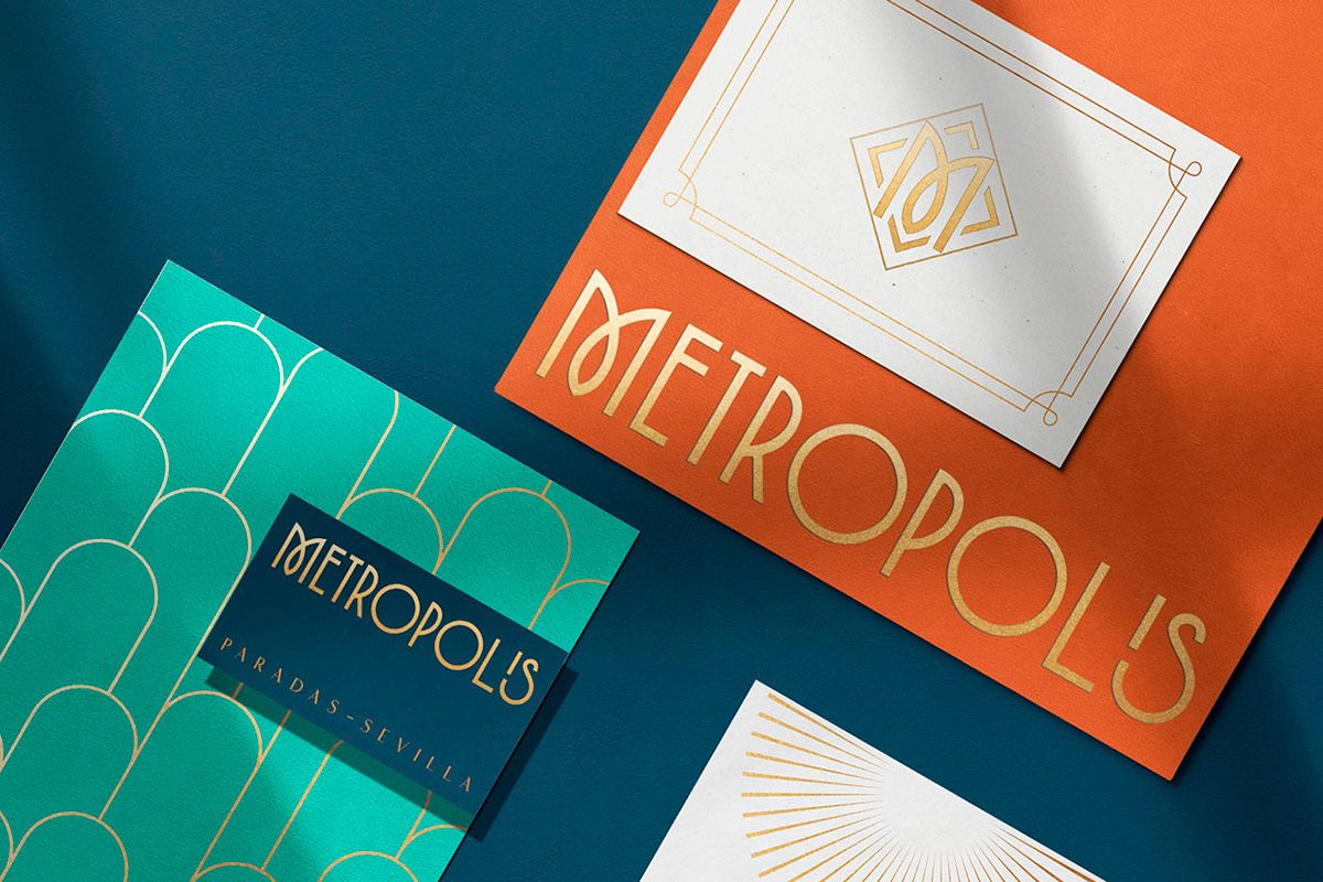
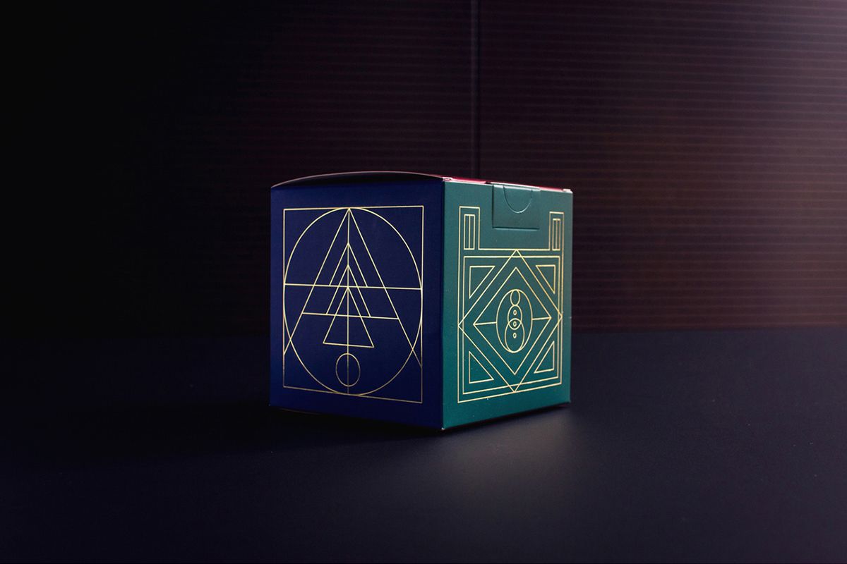
To imagine what the art deco style in design should look like, think of The Great Gatsby style. It is bold, unapologetic, and aesthetically pleasing. The best part of this trend is that it is usually easy to incorporate into the design of anything. From small items like business cards to large format posters.
Simplified logos
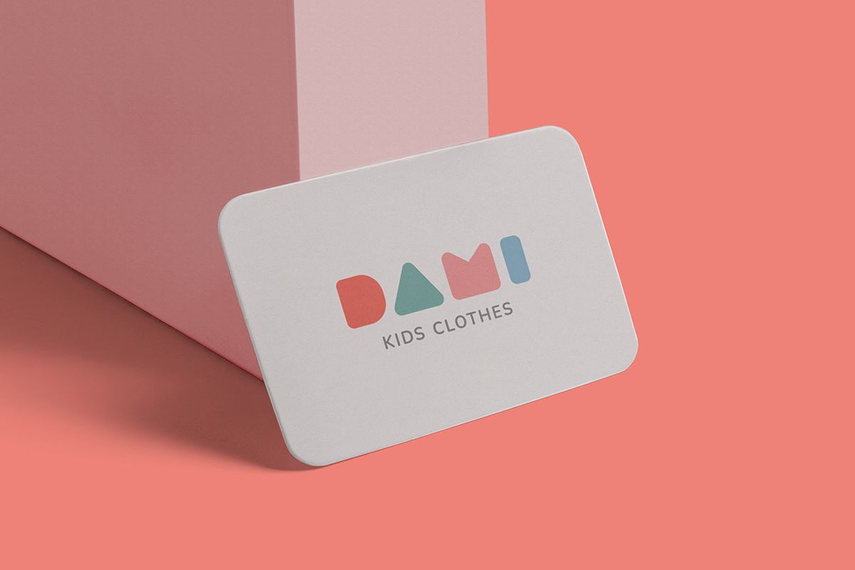
Another one of the graphic design trends that is not heavily packed with details is the simplification of logos. In the age of the internet, our attention span is decreasing. Removing the unnecessary details and keeping the essence of the logo design, makes it easier for your customers to remember. They will retain the viewer’s attention more easily than complex logos. We don’t have time to waste on trying to understand complicated designs. We want something easily recognizable that stands out from the crowd. Make it easy to remember, and unique, so everyone can quickly connect it to your brand.
Minimalist retro
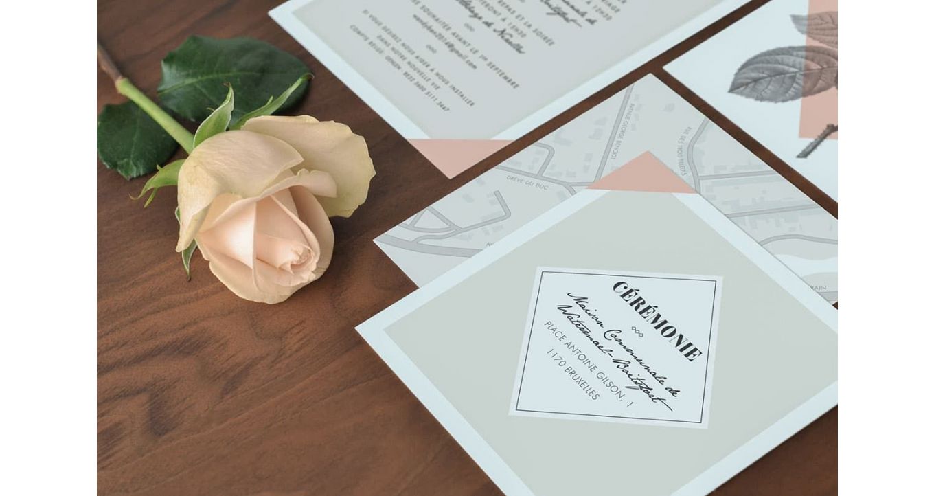
As it is inspired by record covers and 70s magazine layouts, it translates very well to editorial features. But, using old-school fonts, natural textures, and warm tones can also look very good on product packaging.
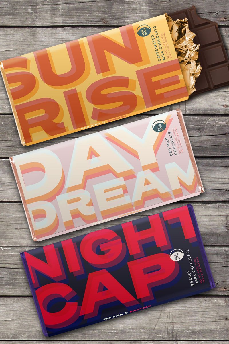
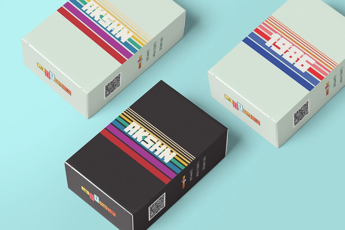
In combination with sustainable materials, this graphic design trend will be a very good choice for eco-friendly, natural, and healthy products.
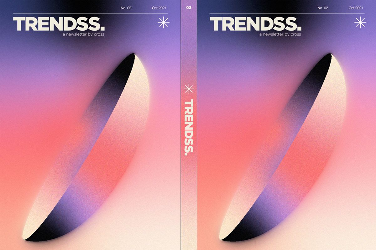
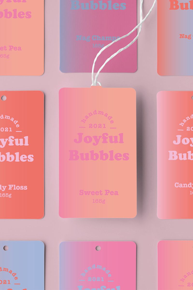
Dreamy muted gradients
This aesthetic doesn’t strain the eye and it is very pleasing to look at. This is just the reason it is often used for branding. You will see it as the background design for a large number of social media posts. Pastel colors are used to create an ethereal look. It promotes calming effects of multicolor blends and grainy textures.
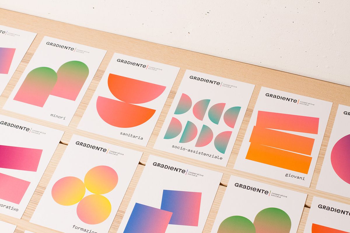
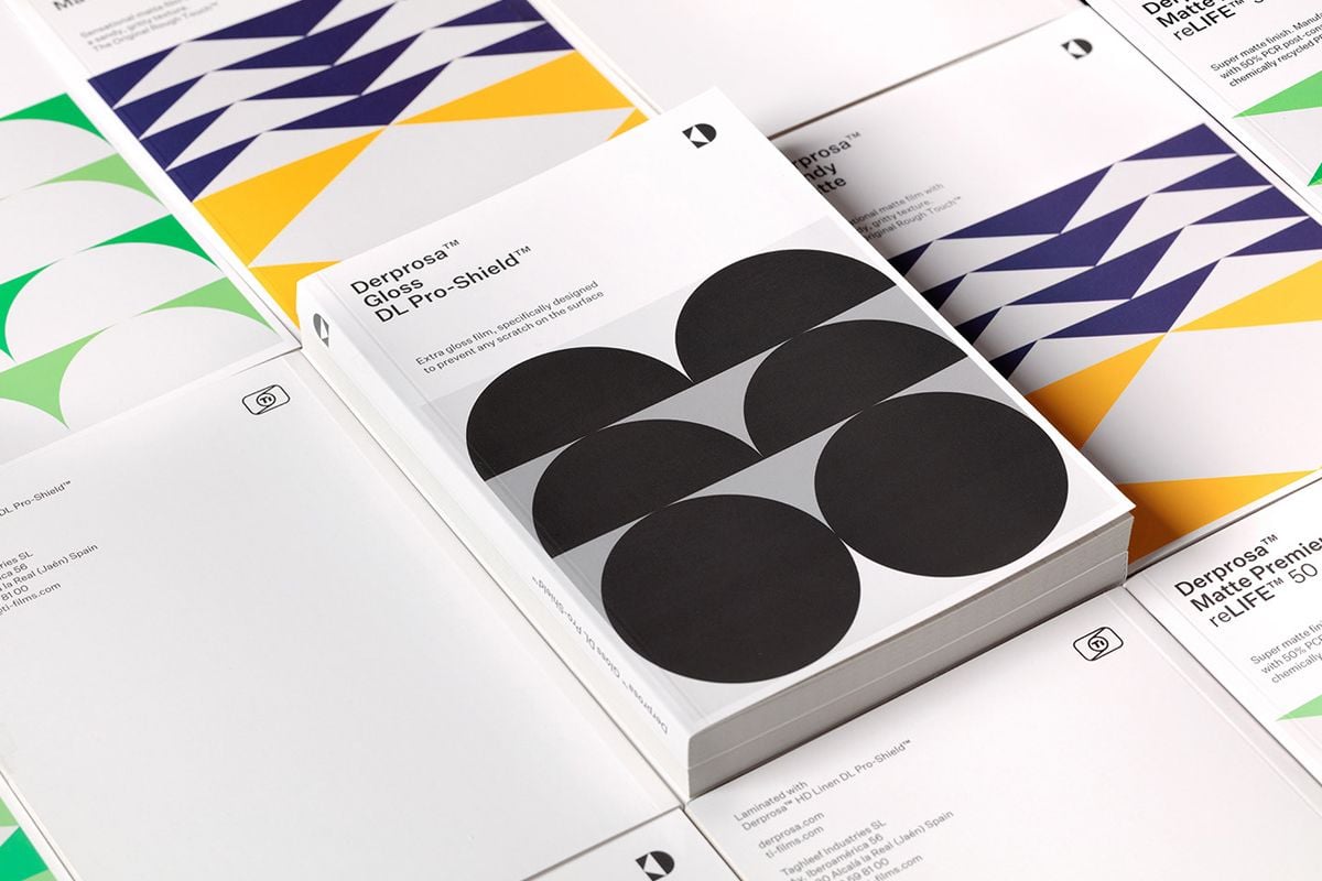
Modular geo
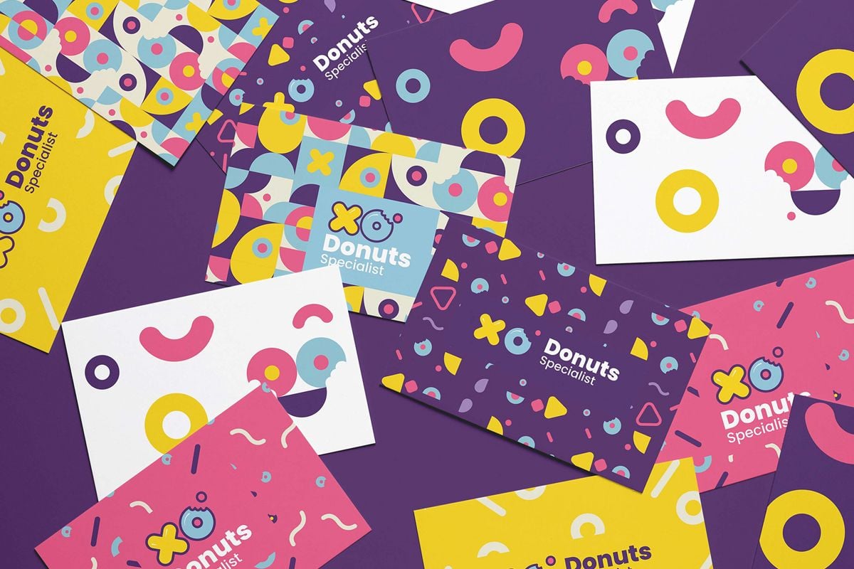
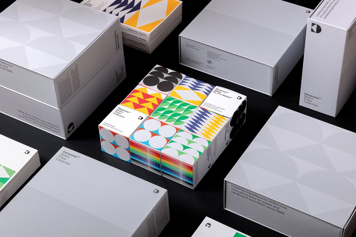
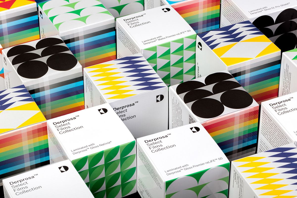
Geometric shapes are replacing abstract forms. There are basically no limits in the way you can use geometric shapes. This gives you the freedom to be trendy and create unique designs. Combine them with images and text to present information in a readable and visually appealing way. They can help you draw your customers or business partners’ attention to certain details you want to make sure are noticed.
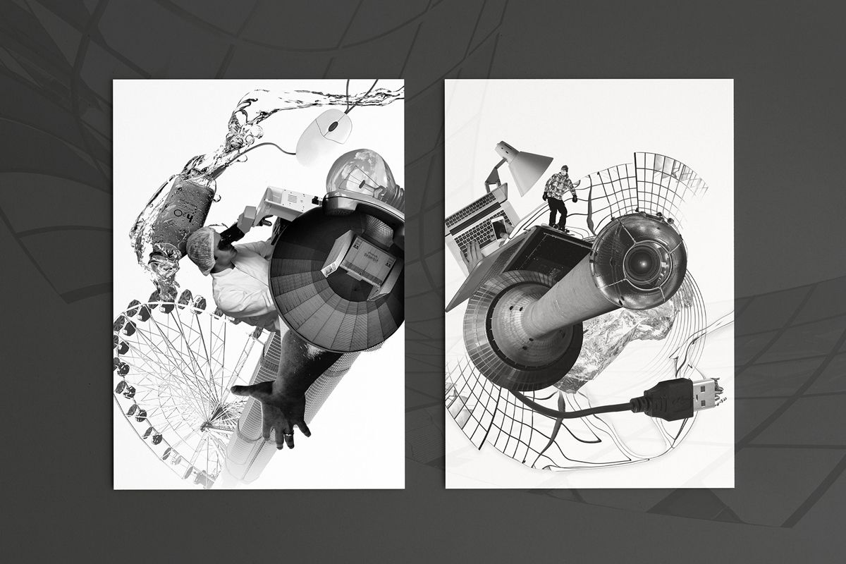
Achromatic design
Achromatic design means using neutral colors in your design. These are black, white and gray. Although it might sound too simple and plain to you, it doesn’t have to be. A good designer will skillfully use transitions from dark to light and create a balanced composition. This can be very effective when done right.
We hope these graphic design trends will help your designs be as trendy and appealing as possible. And remember, there is no need to force it. There should be something among what’s trending that will fit into your design seamlessly. We wish you an inspiring.
If you are interested to see the evolution of the trends, also read our Inspiring Graphic Design Trends blog post.
Are there any trends you have seen that are especially interesting to you? Let us know.
